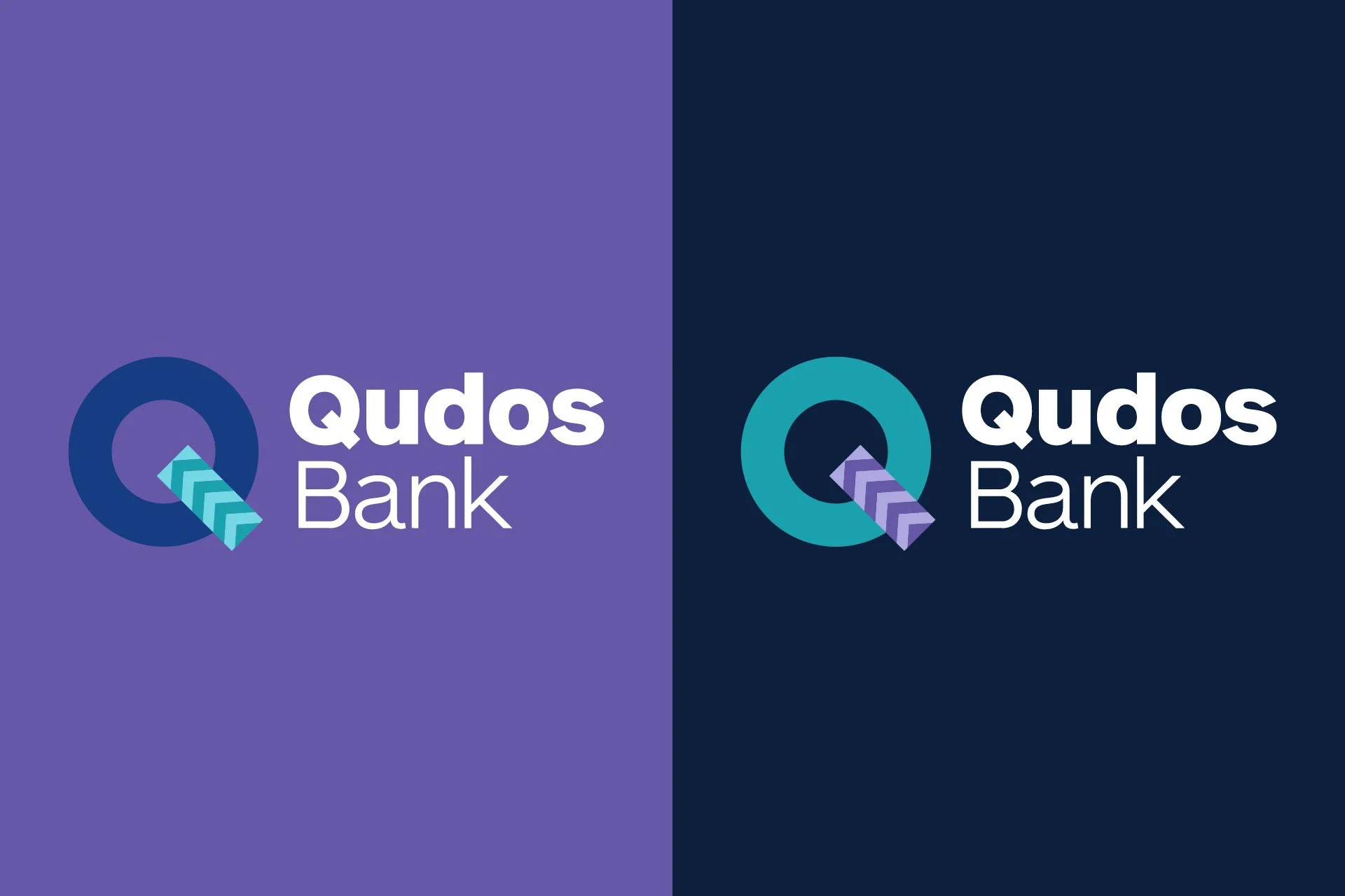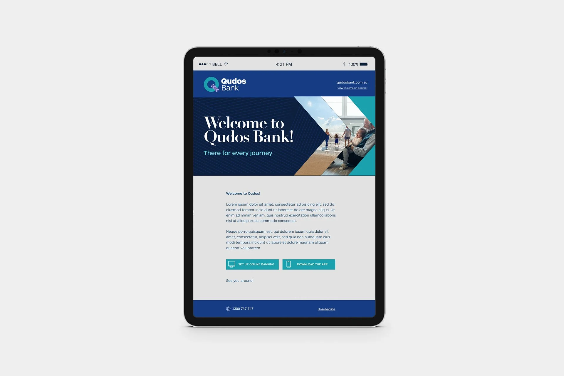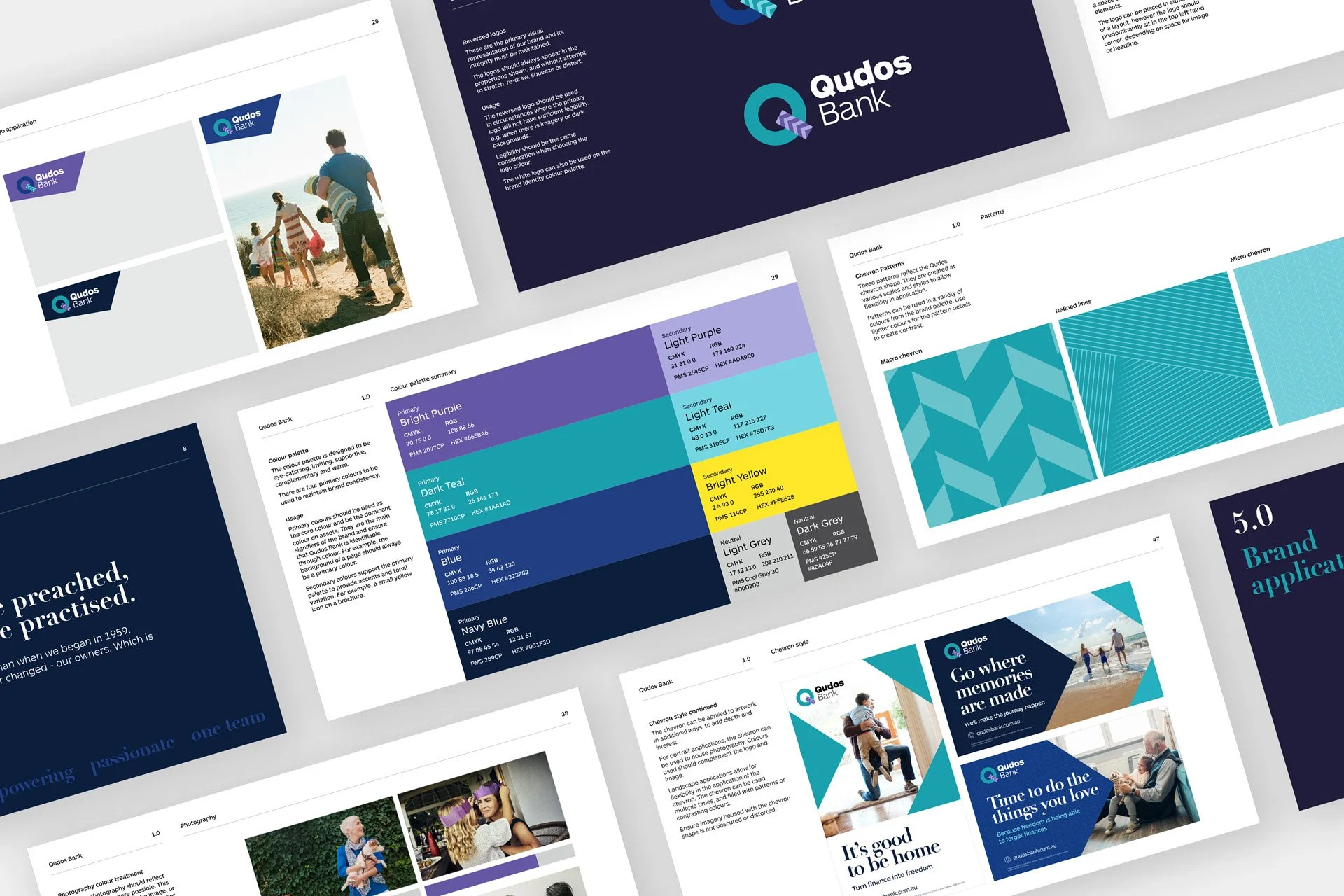
Qudos Bank underwent a rebrand in 2015 (from Qantas Credit Union), yet had since refocused their vision & target audience. The new tagline ‘For all life’s destinations’ provided an anchor point for the creative direction. Logo refinements, a streamlined colour palette & typography created the basis for the visual refresh. A suite of new patterns and a clear system for the ‘chevron’ shape ensured that their new identity was contemporary, dynamic and easy to implement across a wide range of outputs.
CLIENT: Qudos Bank | AGENCY: Chello | ROLE: Designer, brand rollout, research, brand guidelines